
A product page can look polished and still leave a shopper unable to answer a basic question. Will this fit? Does it come with the accessory in the photo? Can it arrive before the weekend?
Those gaps matter because the customer is trying to make a decision. Better product pages reduce the work involved in understanding the offer, choosing the right version and placing an order.
The most useful improvements usually start with the questions and interactions that cause uncertainty. Below are ten ecommerce product-page best practices to help you identify those problems and make the buying experience clearer.
What makes a good ecommerce product page?
A good product detail page helps shoppers understand the product, decide whether it suits them and buy the right version with confidence. Its design makes important information easy to find and keeps the purchase process predictable.
There's still plenty of room to improve. Baymard's 2026 product-page benchmark rates 52% of desktop sites and 62% of mobile sites as having mediocre or worse product-page UX.
For your own store, the useful starting point is the customer's task. Look at what they need to know before buying, where they have to look for it and whether the page behaves as they expect. Our guide to PDP anatomy explains the core elements if you're planning a new template.
10 product-page improvements worth making
An effective review covers both the information on the page and what happens when someone interacts with it. These improvements address common points where an interested shopper can get stuck.
1. Use images that answer different questions
Several nearly identical studio photos add less than a smaller set of images showing distinct details. Think about what the shopper needs to inspect: scale, texture, construction, included components and the product in use.
For a travel bag, that could mean a clear exterior view, the open interior, a close-up of the straps and a photo of someone carrying it. In-scale imagery helps customers judge size in a way that an isolated product shot often can't.
Keep zoom useful on a phone and show images for the selected color or configuration. The customer should be able to inspect the version they're considering, without guessing which photos apply.
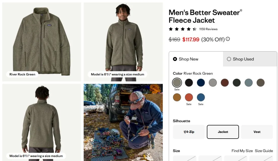
2. Replace vague descriptions with decision-making information
A description should explain what the product does for the customer and provide the facts needed to choose it. “Premium quality” tells someone less than the material, construction and intended use.
For a rain jacket, explain the conditions it's designed for, how the fit works over layers and how to care for it. For a desk, provide usable dimensions and details about assembly and cable access.
Put a short explanation near the purchase area, then group specifications and supporting detail under clear headings. This lets someone get oriented quickly while keeping the full information available.
3. Make sizing and compatibility easy to check
Size labels and model names often leave room for uncertainty. A customer may wear a medium in one brand and a large in another, or own a device with a name that's almost identical to an incompatible version.
Keep size guidance close to the selector. For apparel, explain whether the chart contains body measurements or garment measurements and how to take them. Model measurements and the size worn can add useful context.
For technical products, list compatible models precisely and explain any exclusions. The goal is to help someone rule a product in or out before it becomes a return.
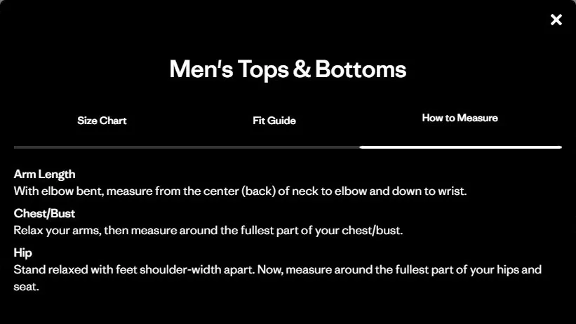
4. Keep variant selection consistent across the page
Choosing a size, color or quantity should update everything affected by that choice. Images, availability, pricing and delivery estimates need to agree with the selected option.
Unavailable combinations should be clear before the customer tries to buy. If they need to select a size first, explain that beside the control and keep their other choices intact.
Test combinations as well as individual selectors. A page might work for the default color and fail when a customer switches to a variant with a different price or delivery lead time.
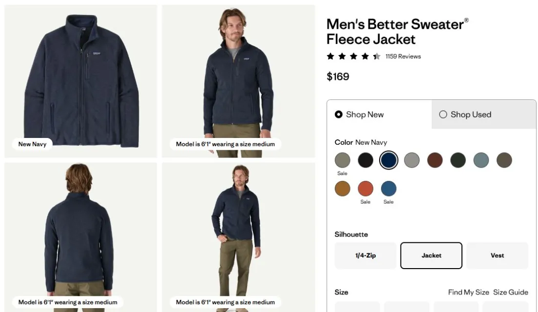
5. Explain the full offer near the buying decision
The customer needs to understand the product price, any savings and the conditions attached to the chosen purchase option. For subscriptions, show the recurring price and schedule as clearly as the first payment.
Shipping belongs in that conversation too. Display the relevant cost, threshold or location-based estimate, with a clear explanation when an exact amount depends on the address.
An estimated arrival date or range is usually easier to act on than a shipping-service label. Baymard's delivery research explains why making customers calculate arrival from “two business days” creates avoidable work.
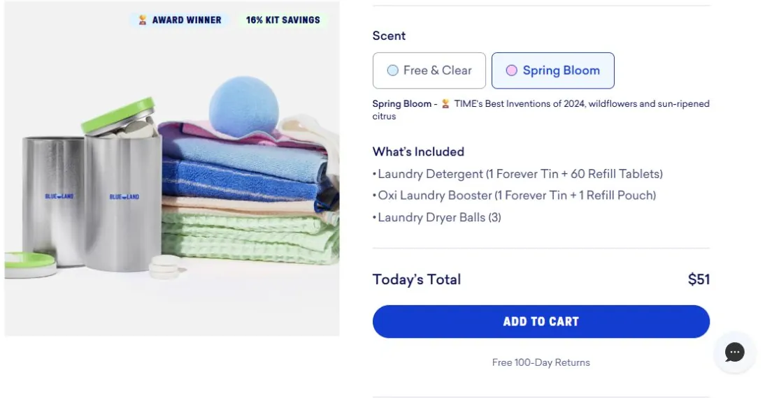
6. Make Add to cart work predictably
The main purchase button should be easy to identify and use. Its label needs to describe the action, and any required choices should be visible before the customer taps it.
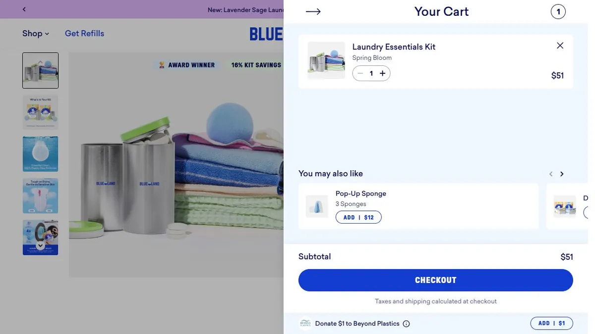
After the action, confirm the selected item, variant and quantity. If something fails, explain the problem beside the relevant control and preserve the customer's selections.
A sticky purchase bar can help on a long mobile page, but it needs to work with size selectors, keyboards and other overlays. Test that it neither hides useful content nor lets someone add the wrong default option by mistake.
7. Make reviews useful to the decision
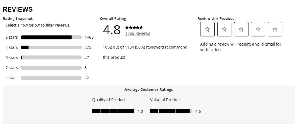
Customers often look for a detail within reviews: how the product fits, whether it suits a particular task or how it holds up with use. Sorting, filtering and a readable ratings breakdown can help them find that information.
Customer photos can add context beyond the brand's own imagery. Keep them connected to the review and relevant product so shoppers can understand what they're seeing.
Questions that appear repeatedly deserve an answer in the main content too. A review widget should supplement a complete product page, rather than becoming the only place where customers can find basic facts.
8. Recommend products with a clear purpose
Recommendations should help the shopper continue a decision. A comparison can introduce an alternative that better fits their needs; a compatible accessory can complete the purchase they're already making.
Explain the relationship through labels such as “Fits this model” or “Complete the bedding set.” Keep the number of choices manageable and avoid letting recommendations displace the information needed to buy the main product.
Useful additions can increase average order value, but check whether they improve the whole order. An intrusive upsell that causes someone to leave isn't a successful recommendation.
9. Improve loading, responsiveness and visual stability
A shopper should be able to see the main product quickly, select a variant without a delay and tap controls without the layout shifting underneath them.
Start with correctly sized images and the scripts used by reviews, recommendations, video and other widgets. Keep the main product image readily available; defer content that doesn't need to load immediately.
Google's Core Web Vitals measure loading, interaction responsiveness and layout stability. Use real mobile performance data alongside hands-on checks, because a page can look fine on a fast office connection and behave very differently on a customer's phone.
10. Keep search data and accessibility in step with the page
A product page needs to remain understandable beyond its visual layout. Use descriptive titles, readable product content, meaningful image descriptions and controls with labels that assistive technology can identify.
Check keyboard navigation, visible focus and whether selection states or errors are communicated without relying only on color. A customer should be able to choose and buy using the input method that works for them.
For search, Google's merchant-listing guidance explains how product markup can communicate price, availability and other offer details. Keep those values aligned with the visible product and selected variants, and validate the implementation as the catalog changes.
How to choose what to improve first
Customer questions, return reasons and observed shopping journeys can help you locate the most consequential gaps. A repeated fit complaint points toward sizing information. Frequent variant errors suggest a selection problem. High exits after opening delivery details may indicate a problem with the offer itself.
Review several products within each important category. A template that works for one simple item may struggle with bundles, subscriptions or products with many variations.
Prioritize changes using the number of shoppers affected and the difficulty of the decision you're fixing. Broken controls and inaccurate information deserve prompt correction. More subjective layout and merchandising ideas can be tested against the current version.
How to measure product-page improvements
Add-to-cart rate is a useful early signal, but the rest of the purchase still matters. Track completed orders, contribution per visitor and returns alongside it so you can see whether clearer pages lead to better purchases.
Use a consistent denominator when measuring a page. For example, the share of product-viewing sessions that add to cart answers a different question from the share of all store sessions that do so.
Where traffic allows, compare versions over the same period and similar audiences. Continue watching the experience after the order, particularly for changes to sizing, compatibility or product descriptions.
Final thoughts
The best product-page improvements remove a real obstacle to choosing and buying. Clear images, accurate options and straightforward delivery information help customers understand the offer and feel comfortable acting on it.
That confidence carries beyond checkout. When the product matches the expectations the page created, you're in a better position to earn the customer's trust and their next purchase.