
In a physical store, customers can pick up a product, look closely at it and ask someone a question. Online, much of that work falls to the product page.
The page needs to help someone understand what they're buying, decide whether it suits them and see how to place an order. Missing information can leave a shopper guessing about size, compatibility or delivery, even when the product itself is a good fit.
A well-designed product detail page brings those answers together. This guide explains what belongs on a PDP, how the pieces fit and how to adapt the page to the products you sell.
What is a product detail page?
A product detail page, or PDP, is the page in your ecommerce store dedicated to an individual product. It usually contains images, a description, pricing, available options and a way to add the product to a cart or buy it.
The product may come in several variants, such as sizes, colors or capacities. Those choices can live on the same page, with the images, price and availability updating to match the selection.
For example, a page for a linen shirt might let customers choose a color and size. It should then make clear which version they're ordering and whether it's available.
The PDP also has to work as an entry point to your store. Someone arriving from search, an advertisement or a shared link may never have seen your homepage. They still need enough context to understand the product and the business selling it.
PDP vs PLP: what's the difference?
A product listing page, or PLP, helps customers browse and compare a range of products. A PDP helps them evaluate one of those products in detail.
| Page | Main purpose | Typical content |
|---|---|---|
| Product listing page | Help shoppers find a suitable product | Product cards, category information, filters and sorting |
| Product detail page | Help shoppers understand and select a product | Images, description, variants, price, delivery and purchase controls |
| Cart | Let shoppers review the order they're considering | Selected items, quantities, discounts and order totals |
| Checkout | Collect the details needed to complete the purchase | Customer information, delivery selection and payment |
These pages should feel connected. If someone filters for a particular size, opens a product and then goes back, preserving their place and filters makes comparison much easier.
The essential parts of a product detail page
The layout will vary with your brand and product range, but the underlying questions are similar. Shoppers want to know what the product is, whether it's right for them, what it costs and what happens after they order.
The following elements work together to answer those questions.
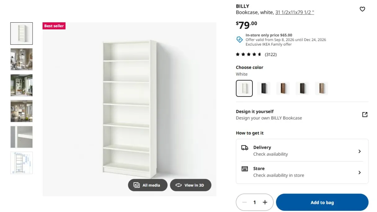
Product name and a clear introduction
The title should identify the product in language customers understand. A creative model name can work alongside a plain description, such as “The Weekender: 35-liter travel bag.”
A short introduction then explains the main use or distinguishing feature. This helps someone decide whether to keep exploring before they read the full specification.
The page should also make the brand recognizable through consistent navigation and design. A visitor arriving directly from an ad needs to feel oriented as quickly as a customer browsing from your homepage.
Images and video
Product images show the details customers would inspect in person. A useful gallery might include the whole item, alternative angles, close-ups and a view of the product being used.
Scale is especially important. A close-up of a bag doesn't reveal how large it looks on someone's shoulder. Baymard's research on in-scale images shows why including a familiar reference helps shoppers judge dimensions more confidently.
Video can explain movement, assembly or a feature that's difficult to show in a still image. It should add information, with a clear way to play, pause and control sound.
Price and purchase options
The price should be easy to find and should match the selected variant. If a larger size or different material costs more, the change needs to be clear before the customer adds it to their cart.
Subscriptions, multipacks and payment options need equally clear explanations. Show what today's purchase includes and any recurring amount or commitment associated with the selected option.
For products sold in different quantities, unit pricing helps customers compare value. A shopper choosing between two package sizes shouldn't need a calculator to understand the difference.
Variants, availability and the buy box
The buy box is the part of the page containing the controls needed to order: variant selectors, quantity, purchase options and the main button.
Selected and unavailable options should be visually distinct. Color swatches benefit from text labels, while size selectors need access to relevant sizing information. The cart should receive exactly the combination the customer chose.
After someone taps Add to cart, a clear confirmation should show what happened. A cart drawer or confirmation message can display the item and selected variant while offering an obvious route to checkout or continued shopping.
Descriptions and specifications
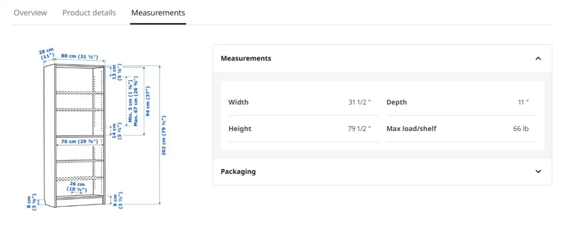
The description explains how the product fits the customer's needs. Specifications provide the detail required to check that it will work: dimensions, materials, ingredients, weight, care requirements or compatibility.
Both have a role. “A compact lamp for a bedside table” helps someone understand the use case. Its height, base diameter and bulb requirements help them confirm it fits their room.
Use headings, short paragraphs and a specification table where they make information easier to find. Important details should be readable text, even if they also appear in a product image.
Shipping, collection and returns
The product's appeal is only part of the decision. Customers also need to understand the cost and timing of receiving it, along with their options if it doesn't work out.
Show delivery information near the purchase controls and provide an estimate based on location where possible. Baymard recommends communicating expected delivery dates because customers shouldn't have to work out arrival timing from a shipping-service label.
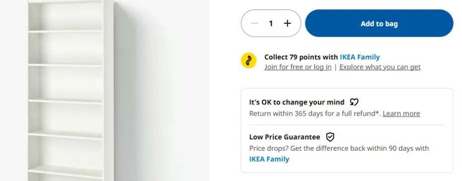
A concise returns summary can explain the window and any important conditions, with a link to the full policy. If a product is made to order, final sale or subject to a special delivery arrangement, that information belongs where someone can see it before buying.
Reviews and customer questions
Reviews can help shoppers understand how a product works outside the brand's own photography and description. Details about fit, durability or a particular use case are often more helpful than a star rating alone.
Make relevant reviews easy to find through sorting, filtering or search where appropriate. Customer images can add useful context, particularly for products whose appearance or scale matters.
Recurring questions are also a guide to missing page content. If people repeatedly ask whether a bag fits a particular laptop size, adding a clear answer to the specification can help future shoppers avoid the same uncertainty.
Recommendations and help
Related products can support a decision when they have a clear purpose. Similar options help someone who hasn't found the right fit; complementary items help someone complete a purchase they've already chosen.
Keep those two jobs understandable. A compatible accessory belongs in a different context from an alternative version of the main product.
Customers should also have a clear route to help. For a considered purchase, an accessible product question or support option may be more useful than another promotional widget.
How to arrange the page
A common desktop layout places the gallery beside a purchase area containing the title, price, key choices and main button. More detailed information follows below, grouped by the questions it answers.
On mobile, the same content usually becomes a vertical sequence. The key is preserving an understandable order while keeping purchase controls accessible. A customer may want to inspect images, check sizing and return to their selection several times.
Expandable sections can keep a long page manageable, provided their labels make the contents obvious. Essential details such as price, selected options and significant purchase conditions should remain easy to discover.
The right layout depends on the decision. A familiar refill product may need very little explanation. A technical product may require comparison and compatibility information before someone feels ready to buy.
How product pages change by category
A shared template gives your catalog consistency, but different products need different supporting information. The most useful additions reflect what could make a customer choose incorrectly.
| Product type | Questions the PDP needs to answer |
|---|---|
| Apparel | What are the garment measurements, how does it fit and what size is the model wearing? |
| Furniture | Will it fit the space, how will it arrive and is assembly required? |
| Skincare | What are the ingredients, how is it used and what quantity is included? |
| Electronics | Which devices or standards are compatible, and what accessories are included? |
| Food and drink | What is the pack size, what ingredients or allergens are present and how should it be stored? |
This is a reason to allow category-specific fields within your product content system. A single generic description box often leaves the team recreating the same information inconsistently across many pages.
Product-page SEO and structured data
Search engines need a clear view of the product too. Descriptive page titles, accurate product copy, useful images and internal links from relevant categories help make each page understandable and discoverable.
Google's product structured data can also make product information eligible for enhanced search appearances. Depending on the implementation, this can include price, availability, reviews and variant information.
The markup should reflect what shoppers can see and buy on the page. Your product content, inventory system and structured data need to stay aligned as prices or availability change.
If the basic content is already in place, our guide to product-page optimization explains how to identify and improve the parts that make purchasing harder.
Final thoughts
A product detail page gives customers the information and confidence they need to choose. Its images, descriptions, purchase controls and delivery details all contribute to that decision.
When those pieces work together, the page does more than earn an order. It sets accurate expectations for what arrives, giving the customer a better first experience and a stronger reason to trust your brand again.